Enterprise Web Design System & Components
Designed and scaled a global system of reusable Figma components and documentation, establishing a unified UX standard that increased development speed across the digital ecosystem.
Role
Design Systems Architect
Industry
IT & SaaS
Focus
Design System & Components
The Goal
To eliminate design debt and accelerate development velocity by building a global system of reusable Figma components and documentation. I focused on creating a "single source of truth" that standardized the user experience across all HPE web properties.
Phase 1: Audit & Foundation
I began by identifying the friction points that were slowing down the design-to-development pipeline.
Component Audit: Conducted a comprehensive audit of existing web properties to identify inconsistent patterns, redundant styles, and "one-off" components.
Stakeholder Interviews: Interviewed designers and engineers to understand bottlenecks in the current workflow, discovering a high rate of design inconsistency due to lack of documentation.
Defining the Core: Established the foundation of the system, focusing on "Atomic Design" principles by starting with base tokens (color, type, spacing) before building complex components.
Phase 2: Modular Figma Component Library
This phase was about building the most robust, flexible assets possible to ensure the system was "foolproof" for other designers. The focus was on creating a robust library in Figma that was both flexible and easy for other designers to adopt.
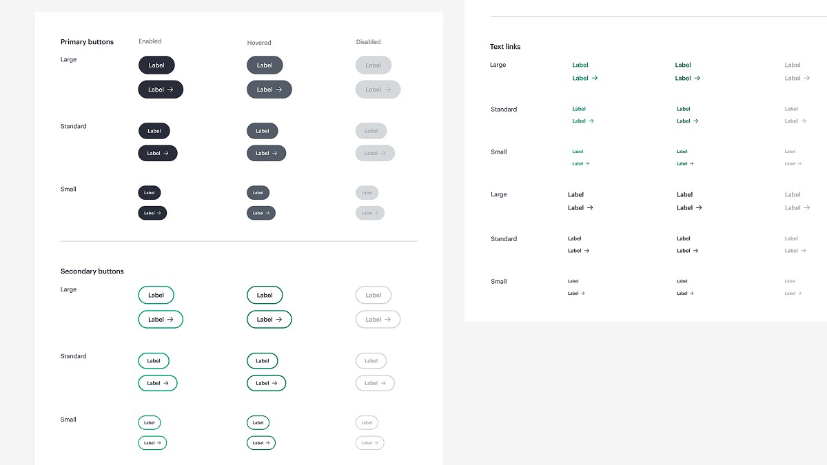
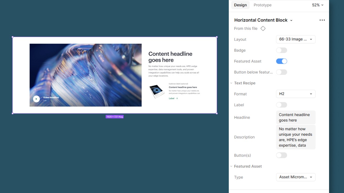
Intelligent Figma UI: I utilized advanced Figma features, including Booleans, Instance Swapping, and Component Properties, to create a library that was intuitive for designers of all skill levels. This allowed designers to toggle complex layout options on or off without "breaking" the component's underlying logic.
Variable-Driven Logic: By embedding variables and design tokens into the components, I ensured that elements like buttons, inputs, and links remained consistent while allowing for variable content lengths.
Developer-Ready Specs: Every component was engineered with clear naming conventions and property structures that mapped directly to the technical requirements of the engineering team.
Phase 3: System Architecture & Component Design
Once the "atoms" were built, the focus shifted to how these components behaved in real-world layouts across a global enterprise scale.
Breakpoint Fluidity: I architected the core web components to be natively responsive, ensuring seamless transitions across five distinct breakpoints from mobile to ultra-wide displays.
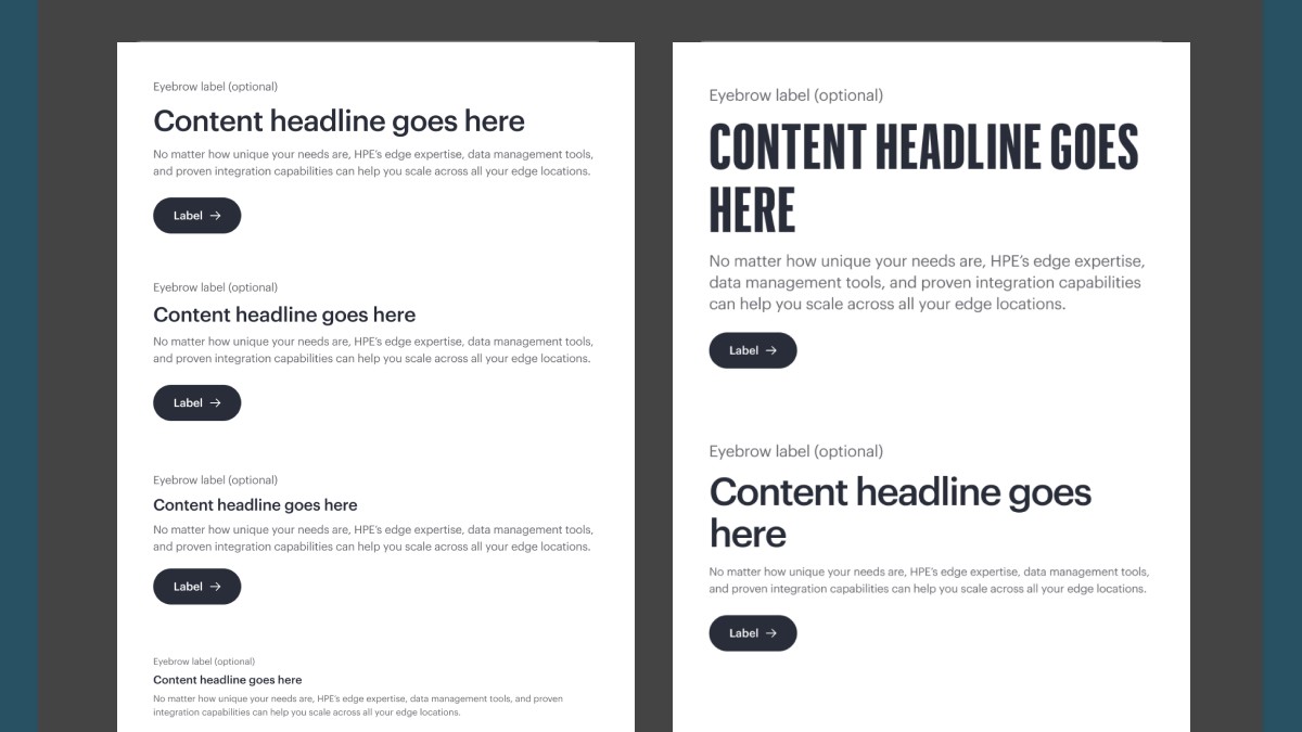
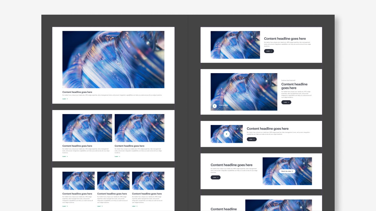
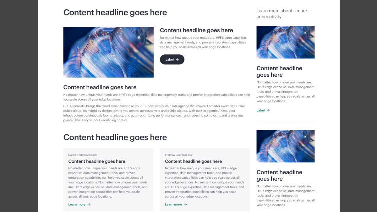
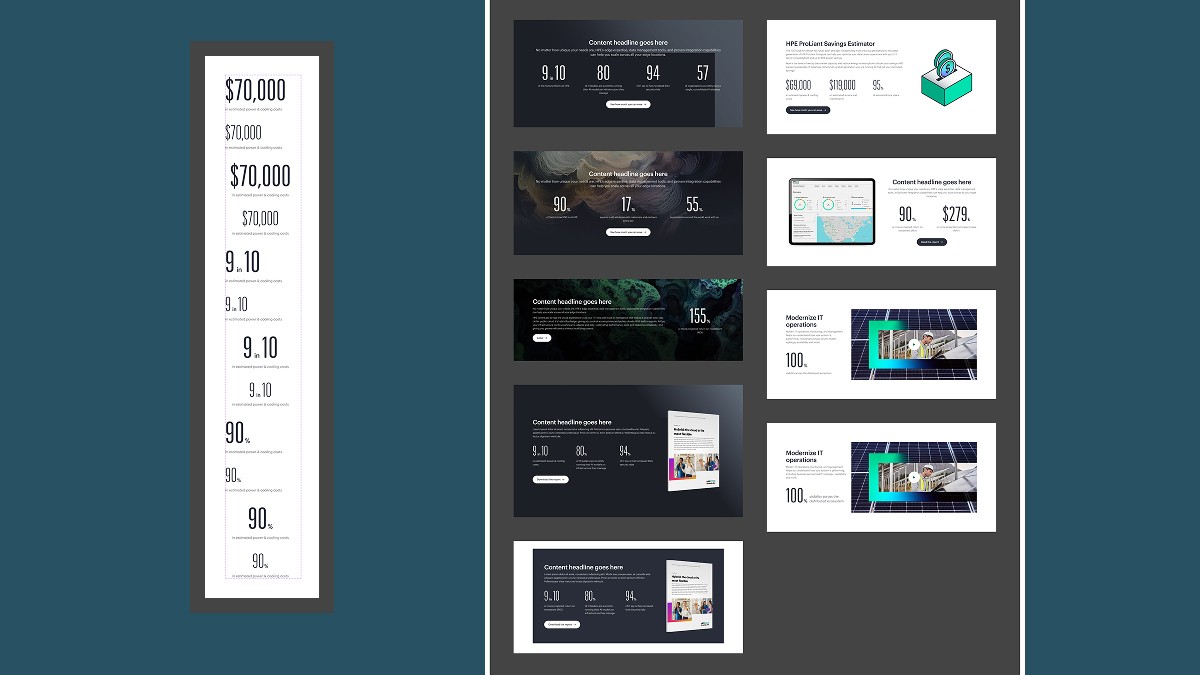
Scalable Page Templates: I developed a suite of "plug-and-play" templates that allowed teams to assemble high-fidelity layouts rapidly while maintaining a unified information architecture.
Systemic Flexibility: These templates were designed to accommodate variable design layouts, providing the necessary "flex" for marketing and product teams without breaking the underlying design system rules.
Phase 4: The Self-Service Platform (Supernova & Storybook)
To ensure the system functioned as a dynamic "Single Source of Truth," the team moved beyond static docs to a live ecosystem.
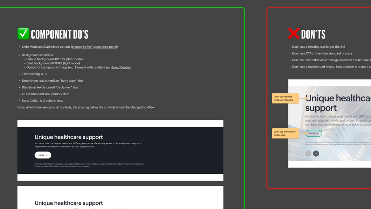
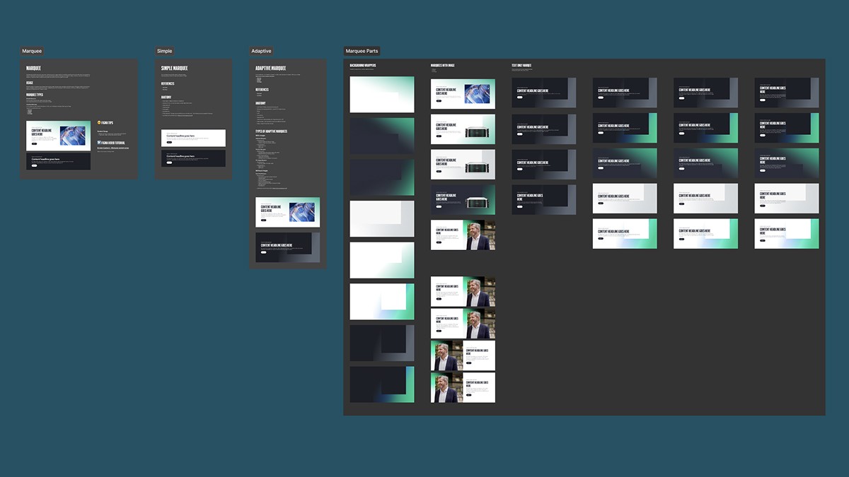
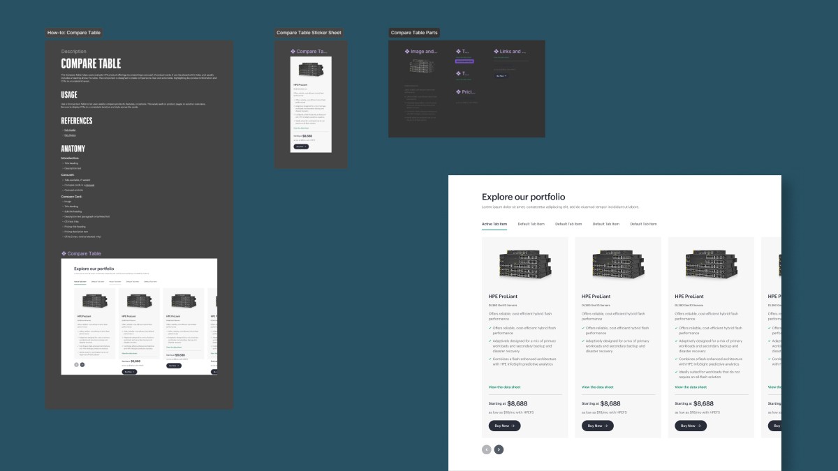
Standardized Documentation Framework: I authored comprehensive component guidelines following the Google Material Design structure. This ensured every asset included a clear Component Description, Anatomy diagram, Usage guidelines, and "Dos and Don’ts" to prevent design misuse.
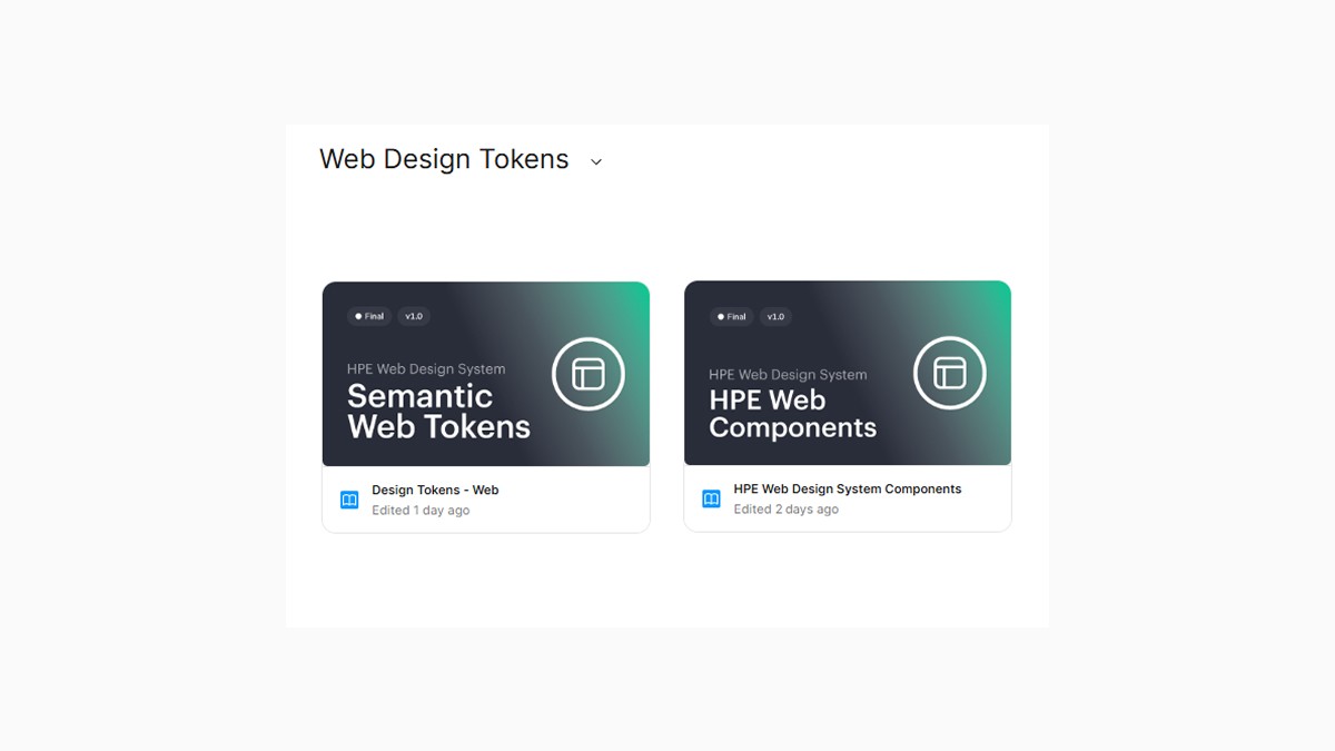
Unified Documentation in Supernova: We integrated the Figma token library and component sets into Supernova, establishing a centralized, self-service hub where stakeholders across the organization could reference the latest design standards.
Syncing Design to Code: In collaboration with the engineering team, design tokens were updated for a 1:1 alignment with the variables defined in Figma.
Centralized Reference: This effort provided a reliable, self-service environment for cross-functional teams, accelerating both design and development cycles while maintaining global brand consistency.
Outcomes & Impact
Once the "atoms" were built, the focus shifted to how these components behaved in real-world layouts across a global enterprise scale.
Accelerated Velocity: Reduced design rework and accelerated the path from concept to code through a self-service model.
Scalable Templates: Developed "plug-and-play" page templates that allowed marketing and product teams to launch new pages 25% faster while maintaining design integrity.
Standardized UX: Successfully unified the user journey across disparate business units.
Enterprise Scalability: Established a permanent "engine" for HPE’s digital presence that evolves alongside the brand’s innovations.